Tuesday, May 29, 2012

You're the Curator.


                 THE OLD SCHOOL VIBE GALLERIA.

           As well all know picking out a theme for your exhibit can be hard, because many of the owners of the exhibits just think about how the art can fit in with the theme and how people would try to look at the work. My theme would be a vintage vibe of old school stuff because I believe that people enjoy art and places that are old school, because they say old school was the best times in the day. I except that my viewers should take in a better feel for art and expect them to analyze the art in a more deeper way while they experience the vintage vibe of the place.  
           As we all know art is something very admired by anyone and what brings more people to looking at is the way the artist paints the piece. I choose three art pieces which brought my attention which where this:
 Andy Warhol. Gold Marilyn Monroe. 1962. Silkscreen ink on synthetic polymer paint on canvas, 6' 11 1/4" x 57" (211.4 x 144.7 cm). Gift of Philip Johnson. © 2011 Andy Warhol Foundation for the Visual Arts / Artists Rights Society (ARS), New York 
 Marcel Duchamp. Bicycle Wheel. New York, 1951 (third version, after lost original of 1913). Metal wheel mounted on painted wood stool, 51 x 25 x 16 1/2" (129.5 x 63.5 x 41.9 cm). The Sidney and Harriet Janis Collection. © 2011 Artists Rights Society (ARS), New York / ADAGP, Paris / Estate of Marcel Duchamp 
 El Lissitzky. Self-Portrait. 1924. Gelatin silver print, 3 x 3 3/8" (7.6 x 8.5 cm). The Museum of Modern Art, New York. Thomas Walther Collection. Purchase. © 2011 Artists Rights Society (ARS), New York/VG Bild-Kunst, Bonn 
 

Man Ray. Rayograph. 1922

Gelatin silver print (photogram), 9 3/8 x 11 3/4" (23.9 x 29.9 cm). The Museum of Modern Art, New York. Gift of James Thrall Soby © 2012 Man Ray Trust / Artists Rights Society (ARS), New York / ADAGP, Paris.

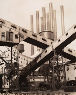
Charles Sheeler. Criss-Crossed Conveyors, River Rouge Plant, Ford Motor Company. 1927

August Sander. Hod-Carrier, Köln (Bricklayer’s Mate, Cologne). 1928

 Pablo Picasso. Les Demoiselles d'Avignon. Paris, June-July 1907. Oil on canvas, 8' x 7' 8" (243.9 x 233.7 cm). Acquired through the Lillie P. Bliss Bequest. © 2011 Estate of Pablo Picasso / Artists Rights Society (ARS), New York 

 Frida Kahlo. Self-Portrait with Cropped Hair. 1940. Oil on canvas, 15 3/4 x 11" (40 x 27.9 cm). Gift of Edgar Kaufmann, Jr. © 2011 Frida Kahlo / Artists Rights Society (ARS), New York / SOMAAP, Mexico 

 Eva Hesse. Repetition Nineteen III. 1968. Fiberglass and polyester resin, nineteen units, Each 19 to 20 1/4" (48 to 51 cm) x 11 to 12 3/4" (27.8 to 32.2 cm) in diameter. Gift of Charles and Anita Blatt. © 2011 Estate of Eva Hesse. Galerie Hauser & Wirth, Zurich 

Robert Rauschenberg. Bed. 1955. Oil and pencil on pillow, quilt, and sheet on wood supports, 6' 3 1/4" x 31 1/2" x 8" (191.1 x 80 x 20.3 cm). Gift of Leo Castelli in honor of Alfred H. Barr, Jr. © 2011 Robert Rauschenberg  

Anne Collier. Cut. 2009. Chromogenic color print, 45 13/16 x 55" (116.4 x 139.7 cm). The Museum of Modern Art, New York. Acquired through the generosity of the Contemporary Arts Council of The Museum of Modern Art. © 2012 Anne Collier, Courtesy Anton Kern Gallery, New York 

Steve Gianakos. She Could Hardly Wait. 1996. Oil and ink on cut-and-pasted printed paper, 27 x 27 1/2" (68.6 x 69.9 cm). The Judith Rothschild Foundation Contemporary Drawings Collection Gift. © 2012 Steve Gianakos 

Claude Cahun. Untitled. c. 1928

Edward Ruscha. Every Building on the Sunset Strip. 1966

Harrell Fletcher. The American War. 2005

        I believe that my selections relate to each other because they present a form of old school drawing something you don't see a lot now in days. They can share some similarities in how old the artist picked out old things from the past to use in the today's world which to me is very fascinating. The purpose behind me presenting this three pieces is mainly because of the way the artist contribute to trying to enlighten the people with a more old school way of art/modern.   To me this art brought my attention because of how well thought the art was, especially with the bicycle wheel because you can see a lot of thought was put into it and not just one of those random arts a person can make. The memory it brings me was when i was young I use to always ride my bike for hours and hours just cursing the streets of N.Y hanging out with friends and just having a great old time. I believe that when i analyzed this pieces of art I was never affected by the fact when it was made or by who , art should just be thought about more deeper and have a feel for it. But at the same time enjoy a persons way of thinking and how they try to make people enjoy their work.

THANK YOU AND ENJOY MY TOP PICKS.

Saturday, May 26, 2012

“Chelsea Galleries Reaction”

                                                     WELCOME TO MY GALLERIA.

                                                  BY: CHRIS


Yan Pei-Ming I admire his artwork, its full of life and the colors amaze me this kind of work I would never look away from. The thing that I like about his work the most was how much detail he puts into the artwork to give great meaning to the piece. I believe that Yan Pei-Ming work should be bought he has a very creative way in presenting his work with the colors he picks out from it to the way he incorporates the message in them. Plain and simple his work should be a BUY! His type of artwork should be displayed forever because the way he draws is amazing and everyone should be inspired by art, especially his. You may ask why would I show this painting first titled Execution Apres Goya, Well first of all this painting shows what small town villagers have to go through with all the war around them and they can't do anything but just watch the ones they love get killed for their resources.
This one right here Titled Moonlight, had me thinking about how dark and bad the sea can be for sailors trying to just make a leaving by catching fish. But the way the color was presented in black and gray and just how he created the water of those two basic colors are very interesting. Also the way the crew can be seen on the ship and another ship behind the main one following. This two paintings by far will be presented in my galleria on just a plain white or red wall just so that the people can focus one the paintings details. 


 Cindy Sherman An artist who's work I really don't admire at all mainly because their all self portraits of herself posing as other people. Her work wouldn't be good for investment to me because I really don't see anything in it to me it looks like she copies and pastes herself on the artwork. I would deffently keep  her paintings in  storage due to the fact that i personally think they're not that good.

This Piece right here i wouldn't use in my galleria because I really don't see no creativity.


Same as this one I really didn't like it because it looks like a photoshoped image.


Yan Pei-Ming
Exécution, Après Goya, 2008
Oil on canvas
110 1/4 x 157 3/4 inches (280 x 400.7 cm)
PEIYA0076

Yan Pei-Ming
Moonlight, 2011
Oil on canvas
110 1/4 x 157 1/2 inches (280 x 400 cm)
PEIYA0116

Cindy Sherman 
  Untitled, 2010/2011. Color photograph, 68 x 96 3/8 inches (image size); 172.7 x 244.8 cm. (MP# 513)

Cindy Sherman
 Untitled, 2010/2012. Color photograph, 71 x 118 1/4 inches (image size); 180.3 x 300.4 cm. (MP# 545)

Monday, May 14, 2012

"Art:21 History Reaction"


Glenn Ligon presents different types of work and different ways to present art and incorporate the past in his work. I like how he can actually take sentences from books he read in the past and use the stencils to present them in a better and artistic way.  Also him trying to draw like a kid made the drawings better to look at because you think to yourself way might have he done this, and he also puts in some famous African American people that helped end racism and slavery into his work to bring back history but in a more modern and creative way. In my mind I believe he brings back people from the past that helped out African Americans because people tent to forget about what happen in the past.

Sunday, May 13, 2012

Quiz make up.

I chose to learn more about the artist Ai Weiwei. I found him to be appealing because
from a young age, Ai was surrounded by art. Ai grew up knowing the power of art and how real art is viewed differently by each person. By growing up with a father as a poet, Ai was more conscious of the creative world around him. His modest personality makes his art work that much more capturing, and made me more curious about his work. Ai came from a background that gave him the potential to become the unique and bright artist he is today.
        One of my favorite pieces by Ai Weiwei is the descending light fixture. I find it to
be intriguing because his main focus he puts into his art is to make the viewer have an open mind and learn something, as well as appreciate the work artists put into their work. He uses “useless objects” to form art into something appealing, and mind capturing. What I like most about this piece is that because of its odd shape, and lack of purpose, there are numerous ways to view its deeper meaning.
        There wasn’t a piece from this artist that I didn’t like, however I did find another
piece of art I came across and found interesting. Ai Weiwei sculpted and painted numerous vases, in no certain order with various different colors. After viewing the work, the artist once again expresses that although the art may come across as useless, the amount of time and effort put into the piece is what can be admired about it. What I like most about Ai is that he has an open mind, and all his pieces vary from one another. Yet, he continues to communicate the same message throughout his work.
        I believe that Ai’s main point in his art is to communicate to all people around the
world that the idea of art is to understand its background, and to have an open mind. I also feel that Ai Weiwei is a unique artist, and is an importance to the art industry in the sense that he stays true to his beliefs, and can comfortably express himself through his work. Viewing Ai Weiwei’s art will always be a learning and eye opening experience.

Quiz Make Up.


John Baldessari in “systems”  was born in National City, California, in 1931.

            The artist presented the pieces “Three Red Paintings” 1988 I liked this particular painting the most because of the way he used three paintings instead of one. The coloring in the paintings are very nice and what left me questing myself was why he would cover the peoples faces with a color such as blue, yellow, or green.  What I disliked a little not too much was the covered faces but at the same time he leaves the audience thinking about what he actually wants to present to them. From the painting I think that his trying to tell a story of a young lady who met a guy and was trying to make a relationship but I might be wrong art is so hard to analyze. The work reminds me of a little of how mysterious life can be and how people can tell a story with a just a simple painting. "Portrait: (Self) #1 as Control + 11 Alterations," this portrait of John shows of how different he can present him self to anyone and maybe the different types of personality’s he has. This can be one of his good work just showing people how can transformer to entertain people. What I disliked was that he could have used some self-paintings in it and some digital something most people don’t do instead of photos. But I’m not an artist so I couldn’t say my opinion on it. The work reminds me of the mona lisa I really couldn’t tell you why but it just did.

Sunday, May 6, 2012

Sculpture Center Reaction


            For our fourth field we went to the sculpture center, which had some very interesting things to look at. All the art had to do with the environment and the place where it was kept. We will discuss the sculptures that were held in there and talk about how they look with the surrounding of an old workshop. I will talk about three pieces of sculptures One that was a wheelbarrow, Watepipe’s and Cyclone Fence.
            First off I will start with the sculpture that caught my eyes at first, was the Cyclone fence the way it was twisted and the way it can make you think of how the artist made the shape. The Cyclone Fence can be affected by the amount of space and its architecture because the warehouse is pretty big and the way that the building is still presented as a warehouse gives the sculpture a better view.  When I first went there the place looked like it was a warehouse it looked nice and all because they kept the old feature of the place which made the sculptures look better and part of the place. I believe that the artwork presents the place in a more creative way and brings life to the place with the creative art.  I believe that type of artwork would have a different type of feeling to it because every museums is known for different type of art but I believe that this Sculptures are better suited in the center. The artworks all interact with each other because their all part of the warehouse image like pipes, a fence, wheelbarrows etc. so many things that can pull off and make the place come to life just by adding a few creative pieces of art.
            Second sculpture the waterpipe’s because they’re very unique I never seen or thought that a pipe with a plastic tubing a piece of art. The Pipes can somewhat bring life to the place but are not very easy to understand what the artist was trying to present.  I believe just because its there it can go with the whole place but in another museum people will think that they were probably fixing up the place with pipes laying around, I don’t mean to sound harsh I don’t have a lot of experience in interrupting art but I do have my opinion.
            The Wheelbarrows with water in them, this particular art is very interesting they had two wheelbarrows with water in the back where the loading gate was. They gave the best image of the place because it was something as if the place was there for a long time and the barrows are collecting the water.  If this artwork were to go to another museum it can pull of in another place. Just because of the way it’s set up and with the water it can make the person think why they put it there.  

Untitled, 1970 (2002)
Wheelbarrows, water
Each: 25 x 48 x26.625 in.
Kunstmuseum-St Gallen.
Reconstruction.
Watepipe, 1970
Plastic hoses, cast iron, brackets.
21 x 41.5 x 2.125 in.., dia. Each: 2in
Marzona Collection.
Cyclone fence, 1968 (2012)
Cyclone fence, 6 x 50 ft.
Reconstruction.  

Sunday, April 22, 2012

“Design in Our Lives”


So we paid another visit to the MOMA this time to experience another type of art, art that involved things people may or may not use in their everyday life. It seemed to make the person thing weather or not we can actually use this type or materials or objects to good use. I will discuss 4 art works, which I will use to demonstrate which are capable of being used in our lives. They will be divided into High functionality and low functionality.

So there was this Blizzard survival bag which the purpose of it is to keep a person warm in bad weather conditions. I believe that the Blizzard survival bag is one of the greatest thought about invention in the world because it can help a human survive in bad environments. Then there’s sea shelter, which is a tent that can float while they’re in the ocean, which can also be, consider a good invention. They both have in common which they can help humans survive in dangers environments. To me what makes them so ergonomic is the way they better a person and help them in needs of over coming any nature environment. For example the survival bag is very useful in cold weathers were you camping in a mountain or when it snows, the Floating tent is useful if you are a very adventures person and you like to be out doors and if one day it rained so hard the tent would be able to float in the water.

Then I have two not functional which was a rescue board made out of cardboard, I would say this is a very bad idea how can a piece of cardboard hold a persons weight it would break the idea is good but the material is just not a good idea, another not functional material which I found completely not useful to a human would be a mask with two long tubing. This two objects having noting in common and are not very useful to human nature, I would alter the rescue board in a metal material so it can hold weight better, and the tubing mask you can change and cut the long tubes shorter so you can make it into a breathing mask or something else. No an object does not need to be highly functional to be a good design, any object and be a good design in any persons view of the design. In my opinion art and design are both consider the same idea because you can attract a persons eye with an object and they can take it as if it’s a piece of art work, even the human body is a art work. Just the way an object makes you think.

In conclusion art can be seen in many different ways it really doesn’t matter of what it is, it can be an object anything that just makes a person think and see it in different ways. Many objects in the world can be functional and not but they were made for a reason.     


 Derek Ryden ( British, b.1956) Blizzard Survival Bag 1998 reflexcell, polypropylene, and rubber. Manfactured by Blizzard Protection System. 

Nikhil Garde (Danish b.1972) Elle-Mile Ejdrup Hansen (Danish b.1958) Barnabes Wetton (British b.1962) Micheal Frederksen (Danish b.1966) Sea Shelter 2004 Nylon Rubber. Manufactured by Viking life-saving equipment. Denmark. 

Hiroyuki Tazawa (Japanese b.1948) rescue board 1998 recycled paper. Manufactured by adachi shiki kogyo Co. 

Anthony Dunne (British b.1964) Fiona Raby (British b.1963) Designs for an overpopulated planet: Foragers 2009. Augmented digestive system, tree processor/digestor, grass processor, Alage digestor. Fiberglass. Gift of the contemporary arts council of the museum of modern art, 2011.  


Sunday, April 15, 2012

“Illustrate a Story”


What I found interesting about this specific story was that the young man could change his way of thinking and become use to what he was going to school for which was cars In my illustration you will notice that in part one how he grow up and how while he was walking he decided to go to school and work hard on cars and not be influenced by people in his society that would bring him down. On the second part was when he was in the automotive class and was the only kid who wouldn't pay attention. Basically this story i can compare to because I myself was a teenager who was rebellious who didn't want to participate in anything that was in front of me until a teacher approached me to change my mind concept.

"Art:21 Transformation Reaction"

Cindy Sherman is a good example of an artist who can transform or set a transformation in a particular drawing. Cindy Sherman can use herself to transform into many different type of characters or people you see in the world, for example when I went to see her art work at the MOMA she presented herself in creative way. Cindy had one art work were she was a clown and that seemed as if she can take a role of someone else and completely transform herself to fit that specific character. You can see that she one of those artist in which she can try to fit a character in order to make her audience think of what shes trying to present in it. To me her different customs lead to her being able to label her as a transformational artist who can change to present herself in different arts.

Sunday, April 1, 2012

“MoMA PS1: The Good, the Bad, and the Misunderstood”


Many people have different ways of seeing art and some look for specific things that attract their eyes, which will make them admire the art itself. With my trip down to the MOMA PS1 I myself found a good painting and bad and one that I completely didn’t understand. I will discuss all my point of views on the artwork and how I feel about them.

One specific artwork that really got my attention and was very well shown on a screen was by Rania Stephan (Lebanese, born 1960 worked on films for two decades) The three Disappearance of Soad Hosni 2011 Video (color, sound) 70min a video in which this artist took of a actress. The whole video consist from her first movie she did to the end to the end of the last movie she made in order to give a story of Soad Hosni. The piece really showed that he put extremely hard work in order to use all of her movies to make one movie with different clips to me it showed that Rania is a very smart individual.

One artwork that really didn’t catch my eyes was by Frances Stark (American born 1967) My best thing 2011 Video (Color, Sound) 99.17 min. This was a video of two animated characters talking about stuff, which really just bored me, and I didn’t really seeing anything that had to be even compared to ART. What really throws me of from this piece was just the whole video it was pretty creepy. I would say to an extent I would learn how to appreciate this artwork but really it would take me time and learn a way in which I can really see what the artist is trying to present to the people.

The third artwork, which will be the one that I completely didn’t understand, was by Henery Taylor (California Born 1958) it’s like a jungle 2011 found objects. This specific work was very confusing yes I got the concept of the artwork from the title but I would want to know why he used the different objects it just seemed like it was trash but at the same time something that was pretty much worth looking at.  I believe that artwork doesn’t need to give you all the answers it should make the person think about it in which you leave him with a memory of your artwork.

At the end of the day many people have there own opinions about artwork and how they look at it but to me art is something very nice to come across to see how people can think and how they want to grasp your eyes and imagination.

Sunday, March 25, 2012

“Art and Identity: The Museum of Modern Art”


Our visit to the MOMA museum we had to study and observe the way the was being presented in the Contemporary Galleries from 1980-till now and the Cindy Sherman art. To me identity in art can be translated to how a person express the message they are trying to give through a specific painting.

The first work of art I found very interesting was Painted By: Marlene Dumas South African, born 1953, paintings name is Wall Walling. The painting basically consist of African American people probably a little village getting harassed by soldiers. I believe that this painting is a Identity of culture and how different it is outside of the U.S and how people tend to suffer and have to learn to fear the Soldiers for there life’s or else they will get killed.  In the imagine you see that the people are being held up against the wall and are being inspected by the soldiers meaning maybe the Soldiers are looking for valuables or something.

The Second painting is painted by: Ryoko Aoki a Japanese artist born 1973, the painting is called From the tip to the head. The painting easy to get that he had like a personal message in the painting itself that he probably feels as if his on top of the mountains or his the head of the mountains which to me means he was feeling free and head of that mountain which in the painting itself shows the freedom with the birds flying around, the wild, and just being out in nature.

The third painting is by: Doris Salcedo Colombian, born 1958. The painting is called Atrabiliarios, which consist of some high heels stuck in a plywood wall with animal fiberglass. I believe this is a very interesting art piece because it took me a long time to actually make sense of it, but which I still don’t get a since of the piece but I can say that maybe this shoes were something special to her which she decided at the end to make art out of it to show her special belongings.

In conclusion all this arts have their own meanings but people can interrupt them in a different way and get a better image of it in your own mind. This three arts where part of the contemporary galleries from 1980 till now.  

Tuesday, March 13, 2012

"The Narrative Digital Collage"

I basically made this collage because I'm a big horror movie fan, and zombie movie fanatic as well. So for this collage I incorporated different type of things you would find in a basic zombie movie which would be a horde of zombies, army, transportation, heavy weapons, a house, helicopters, RPG's, snakes and survivors.

Saturday, March 10, 2012

“Good Art vs. Bad Art.”

GOOD ART.
      Many people have their own opinions on how they see art. One of the ways they see art is as in Good art. To me good art is someone who takes their time to get creative and show a lot of good thoughts in there paintings. Art that can also be interpreted in different ways like a picture that can mean 100 different things depending on who looks at. Anything that can also capture a persons eyes has to be a very fine art piece.
This painting i find it to be a very interesting painting because of the way it is the coloring the facial expression of the person. I like this particular drawing good art because I feel as if i can connect to the painting itself, if that makes any sense. But how the character is in shock and how sometimes I get shocked at what i see outside with different people.     

BAD ART.
 In another hand people have opinions on bad art, To me bad art is a Painting in which has a horrible coloring or basically i can't really grasp what the artist was trying to present to the viewer.  Weather if its bad art or not people always tend to appreciate it at the end and look at very different. Bad art is sometimes hard to determine but when an individual can't have a connection with it they tend to just say "oh this is just wack" meaning they don't like it.

As you see in the painting above i find it to be bad art because of the way the coloring was in the painting it was very complicated to determine what the artist was trying to give to the audience.